
How to use colour psychology in your home
- Nina Di Marco

- Oct 16, 2023
- 2 min read
Colour can hugely affect not just how a space looks, but also how a space feels. Colour psychology is the study of how different colors affect human mood and behavior, as colour has the potential to change your emotions and how you perceive a particular object or room. This is important to consider when selecting materials, furniture, joinery, paint, and decor for your home - especially if you are hoping to evoke a particular mood within a space. We have put together 3 main categories of moods that we often design for, with the colours that best suit within each category:
1 | Soothing and Calming
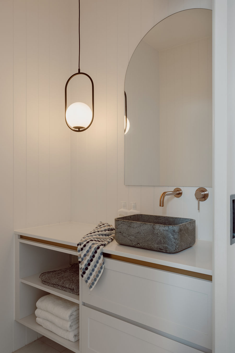
These colours are often associated with relaxation, calmness, and tranquility. They create a serene atmosphere that is perfect for spaces where you want to unwind and rejuvenate. Consider using these colours in bathrooms, bedrooms, reading nooks or home offices and lounges made for relaxing:
Soft Blues: Muted shades of blue evoke a sense of calmness and serenity, reminiscent of the sky and the ocean.
Lavender: This delicate shade offers a soothing and elegant ambiance, promoting relaxation.
Soft Greens: Muted greens evoke a connection to nature, creating a peaceful and refreshing environment.
Muted Greys: Light grey tones create a neutral and calming backdrop, allowing other design elements to shine.

2 | Joyful and Exciting
Joyful colors are vibrant and energetic, evoking feelings of happiness, optimism, and creativity. They work well in spaces where you want to uplift spirits and foster a lively atmosphere. Consider using these colours in an entry way, a playroom or rumpus, kitchens, home gyms or lounges made for socialising:
Sunny Yellows: Shades of yellow bring warmth and positivity, reminiscent of sunlight and happiness.
Playful Pinks: Soft pinks to bright fuchsias infuse spaces with a sense of fun and vibrancy.
Cheerful Oranges: Orange tones bring energy and excitement, creating a lively and welcoming environment.
Aqua Blues: Bright aqua or turquoise shades introduce a refreshing and invigorating feel.
Lively Greens: Bright greens symbolize growth and renewal, adding a lively touch to interiors.

3 | Sophisticated and Timeless
Timeless colors have a classic appeal that transcends trends and eras. They create a sense of sophistication and elegance, making them well-suited for spaces where you want a high-end feel. Consider using these colours in a formal dining room or formal lounge, master bedrooms and home libraries.
Neutral Greys: Classic and versatile, grey tones provide a timeless backdrop that can be paired with many accent colours.
Deep Blues: Navy and rich blue tones exude elegance and depth, creating a sense of luxury.
Rich Burgundies: Deep reds and burgundies evoke a sense of opulence and traditional luxury.
Earthy Browns: Warm brown tones offer a sense of comfort and grounding, perfect for creating inviting spaces.
Classic Whites: Crisp whites signify purity and sophistication, allowing other design elements to stand out

I hope these ideas have been helpful! If you want to find out more about how we can help you with your project, get in contact with us below:
Have a wonderful week!
Nina xx


Comments